5 Awesome A/B Testing Ideas to Boost Your E-Commerce Conversions

Have you ever gone online shopping, only to find out that you can’t find the checkout button? Maybe you’ve looked through photos of products and found them unappealing? If done poorly, these seemingly simple elements of a website make any e-commerce site lose conversions. Fortunately, A/B testing allows e-commerce sites to test various aspects of their websites in order to make the experience more desirable to consumers.
What is A/B testing?
Before we look at the different aspects of A/B testing that can be used to enhance e-commerce sites, it is important to understand exactly what it is. Here’s a great beginners guide for those who want to dive into A/B testing.
For those who just want a SparkNotes version, A/B testing is a way of comparing different variations of site elements. You can A/B test a homepage image, the color of a CTA button, and beyond.
Visitors are randomly assigned to one of the versions, and you can run statistical analyses to track various goals such as clicks, conversions, and so on. Clearly, A/B testing can generate a lot of great insights about your website.
Now, if you’re an e-commerce business owner, you might be wondering: “Okay, so A/B testing awesome. But where do I start? What aspects of my website should I test that could help my website?” No worries. Here are 5 great elements to A/B test on your e-commerce site.
1) Add product videos
Two words: Product videos. When customers shop online, they want to do their research. Adding product videos is one way to do that, as it gives customers a detailed, virtual experience with the product that offers way more than simply a description or a picture. By A/B testing product pages with and without product videos, you can find out for yourself if the videos boost your conversion rates.
In fact, a report shows that even when users don’t watch the video, conversions rise when the video option is present. This tactic has already been helpful for many e-commerce sites. Appliances Online tested video reviews and found that someone who watches the reviews are 120.5% more likely to buy, spend 157.2% longer on the site, and spend 9.1% more per order. Check out this blog to get more tips on how to use videos on your website effectively.
2) Create urgency with timers
Sure, you can always create a button that says “BUY NOW”, but an even better way to create a sense of urgency is by testing the inclusion of a timer.
Whether it’s free shipping or a weekend sale, letting customers know how much time they have until the sale ends will give customers the sense that they cannot wait any longer to buy your products. Try testing the addition of a timer and see if it increases conversions.
Here’s an example of ExpressWatches implementing a timer on their website:
3) Product images
Especially in e-commerce, A/B testing your product images and models is critical. Having appealing images will go a long way in convincing customers to buy your products. One of the key aspects here is to always test including people in your photos.
Including photos with people makes the product more engaging to the consumer, and will give them the impression that people are satisfied with the product. In addition to A/B testing human images versus images without people, you can also A/B test stock photos versus custom images.
Lots of research has shown that human images can be beneficial for many sites. Of course, this isn’t always true for every single site—but that’s why you A/B test!
4) Recommendations of related products
One survey showed that 59% of retailers don’t know the conversion rates when shoppers preview up-sells or cross-sells on product pages. It is important to know these numbers when designing the optimal website.
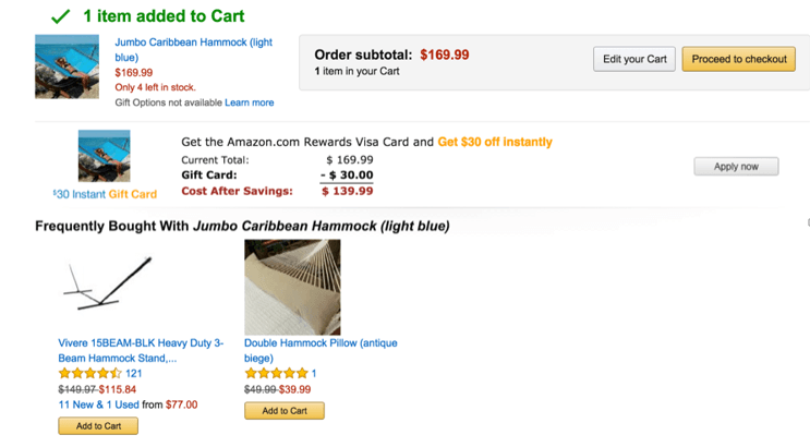
Some websites prefer keeping a simple page without recommended items, whereas sites like Amazon put many recommended products on its website. Without testing and tracking results, it is impossible to know which option is best for your e-commerce site.
5) Call-to-action buttons
Another key aspect of an e-commerce website that should be A/B tested is the call-to-action buttons, such as “Buy Now” or “Add to Cart”. The design of these buttons is especially important for catching the user’s attention and convincing them to actually do the thing you’re telling them to do.
The types of changes to A/B test range from altering the color of the button to changing the shape. For instance, Amazon’s button is a combination of an oval and a rectangle.
Another example of a test is comparing the language of “Buy Now” and “Add to Cart.” Some studies have found that the “Buy Now” button increased conversions, whereas “Add to Cart” increased average order values.
Bring meaningful change to your e-commerce site with A/B testing
In an ever-changing e-commerce world, it is crucial to keep with the recent trends. A recent article by Optimizely points out three major trends in optimization: customer experience is the differentiator, continuous testing helps fuel rapid decision-making, and the impact of mobile is rapidly expanding.
For any e-commerce site, understanding these trends and implementing A/B testing will bring meaningful changes for both the short-term and long-term. Happy A/B testing, everyone!
—
Do you have any recommendations for other elements to A/B test on an e-commerce site? Let us know by tweeting us at @Perfect_Search!


