
Why Brilliant Design Makes Your Banner Ads More Effective


If you’re an avid internet user (and let’s be honest, who isn’t?), you’ve probably gotten annoyed by ads badgering you everywhere. They’re in the margins of every site you visit, they pop up at you unexpectedly, and they’re on your Facebook and Twitter feeds. Most of the time you try to pretend they aren’t there–but every so often you’ll stop and look at one that caught your eye. Maybe you’ll even click on it.
What was it that made you stop? I’ll tell you what it was: good design. Or, okay, maybe it was the cute boots you had sitting in a shopping cart somewhere being retargeted to you with some sort of discount code. (That’s real. Next time you want to buy something, put it in your shopping cart, let it sit there awhile, and see if a coupon pops up on some site you’re trolling.)
But back to good design. It truly makes the difference between an irritating ad that you scroll past or an ad that invites you to click and learn more. Read on to find out exactly why good design matters for banner ads–and what actually makes good design, well, “good.”
First, what exactly is a banner ad?
To put it simply, a banner ad is just an image-based ad. Two of the most common places banner ads show up are on the Google Display Network and Facebook. The Google Display Network includes over 2 million sites like YouTube and The New York Times, and it shows both display ads and remarketing ads. In other words, Google Display Network banner ads include any of the image-based ads you see on most websites you’re on.
Facebook banner ads are also image-heavy. They show up in your newsfeed or in the right column of your Facebook homepage. It’s important to note that Facebook banner ads, unlike Google’s, have a pesky 20% text rule. This means that only 20% of the ad can have text. Naturally, this makes the image’s design all the more important.
Even Netflix understands the importance of images
When Netflix tested different images for a show’s thumbnail, they discovered that the image mattered 4 times more than the text describing the show. Strong, well-designed images actually kept their users browsing on their site.
Take it from Nick Nelson, Netflix’s global manager for creative services, who said, “Images become the most efficient and compelling way to help them discover the perfect title as quickly as possible.” You can take this idea and apply it to banner ads. Good banner ads can be an efficient and compelling way to get your audience to your site as quickly as possible. Learn exactly how below.
4 things good banner ads can do for your business
It’s tempting to want to rush through the design process because you want an ad out there fast. Also, it can be difficult to have tangible data on what works and what doesn’t. Even when you do have data on what types of ads could perform well for your business, it’s not always clear what the best design should be.
Still, dedicating time to coming up with a strong design will always be worth it. Here’s why:
-
It gives a great first impression of your brand.
-
It establishes trust and authenticity.
-
It gets users to convert.
-
It’s memorable–so users will visit your site long after they’ve spotted your ad.
1) First impressions really matter
For some users, seeing your company’s banner could very well be the first they ever hear about your business. Naturally, you want to make a good first impression.
With banner ads, you should think about how you want to convey your brand. If you’re just starting out, it’s always good to check out what your competitors are doing. Companies in the same industry tend to use similar imagery and style. Consider these computer ads with the logos and text removed:


Crazy, right? They all look like they could be part of the same company. The top-left ad is Intel, top-right is Lenovo, and the bottom ad is for Microsoft. All of the ads have a solid-colored background with an image of their product. It’s straightforward for the user to see, ‘Oh, they’re clearly trying to sell me a computer.’
Getting design inspiration from competitors can be a good starting point because big companies have usually done research on what works and what doesn’t.
But, of course, that’s not everything that goes into creating your first banner ads. You have to think about what your brand is, how you want it conveyed in an image, how it will attract the audience you’re looking for, and so on. And all these things take time–but it’s worth it.
2) Establishing trust goes a long way
What makes you a trusted brand? If you guessed design, pat yourself on the back.
Good design gives your company legitimacy and authenticity. Think about an ad that is just black-and-white with text as opposed to an ad that is clearly clever and aesthetically pleasing. Which ad would you trust more? Therefore, which ad would you be more likely to click on? Most would trust the well-thought-out ad more.
For instance, check out these two ads:

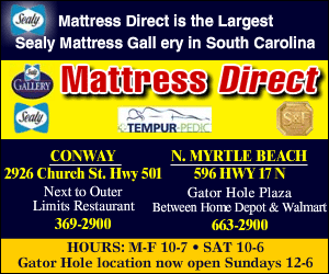
Which would you choose to buy a mattress from? I’m just going to assume you’re like me and you see the left image as more trustworthy. Not only do elements like composition, legibility, simplicity and a strong call-to-action make a banner well-designed; they make the ad seem more legitimate.
After all, good design choices convey to the viewer that your business makes wise decisions when representing yourself. Companies who take the time to understand how they’re being received by their target audience and make smart design choices based on that will reap the benefits.
3) Think about what will make users convert
Ultimately, a conversion–whether it’s filling out a contact form, making a phone call, or purchasing a product–is likely the main outcome any business wishes upon their banner ads. That’s why using research on what makes users convert is vital to any successful banner ad.
Our research at Perfect Search has taught us a couple of specifics for what works with our ads. For example, images with smiling, forward-facing people tend to outperform images with people looking away or no people at all. These Unbounce stats support the idea that images of people can be the way to go for certain businesses.
To really figure out what design elements convert the best for your banner ads, it’s vital to test, test, and test again. You may have a well-designed ad, but the ad copy or call-to-action just isn’t drawing people in. What if the ad itself is perfect but the targeting options are off? Or what if the call-to-action works well, but you decide to test a different human image?
Your first ad design, even if it’s a good design, doesn’t mean the process is over. Conversion rate testing is essential to any design–and advertising–strategy.
4) Memorable ads have a lasting impact
Let’s face it. We’re all so used to seeing ads that if an ad doesn’t stand out, it’s easy to just scroll right past it.
Differentiating yourself and going outside of the box can engage viewers and draw them in out of curiosity. Consider the following ad:


Slack’s banner ad on the Google Display Network uses creative text and bold, comical imagery that ensures that it stands out from the sea of boring ads. By now, Slack is pretty well known in the workplace. However, if I hadn’t heard of them yet, I imagine that I would’ve clicked on this ad just to see what it was all about.
Instead of showing the straightforward image of an employee at a computer chatting with his co-workers, Slack’s ad gets inside the heads of its users and targets their needs and emotions. By showing the app’s benefit in such a unique way, it makes its mark.
And, of course, ads that stand out are memorable ads. I mean, when I was trying to think of a creative ad to show as an example for this point, Slack’s ad immediately came to mind.
Just imagine if your viewers saw your ad once and remembered to go back to it later because they were intrigued. That would lead them to your website, which could then lead to a conversion. That’s the power of good design.
—
Do you remember any great banner ads that have stuck with you? What are the ads that make you stop and click? Share them with us by tweeting us at @Perfect_Search.
For more design inspiration, check out Anna’s post on the importance of custom images. If you realize that your business could benefit from better banner ads, learn more about our design services and contact us.

Anna Allingham lives in the outskirts of Denver, Colorado but will always be a Chicagoan at heart. When she’s not geeking out over data visualizations and playing Stardew Valley, Anna spends her days planning her next trip – and a safari in Tanzania is at the top of her list.