The Rise of Photography and Typography on the Web
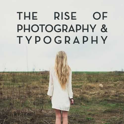
A good website starts with good photography. It allows for a company to showcase its brand in an extremely visual (and often unexpectedly artistic) way, and for people to connect with the brand on a more personal level.
The biggest trend lately is the pairing of concise typography with strong, unique images for homepages. This isn’t just for trendy ad agencies, fashion designers, and artists anymore; it’s being picked up by many different industries. This means that some industries have to find ways to acquire high-quality pictures, as they may not all have access to top notch photographers. That’s where crowd-sourcing has come in.
“Photo networks also offer the opportunity to crowd-source images that reflect brand’s products and turn SEO oriented web pages into a visual display of authentic, social-imagery that leads consumers to purchase and share. Crowd-sourced images are emerging as a great way for brands to tell their stories in visual and inspiring ways,” wrote Piquora’s CEO Sharad Verma in this blog post.
Personally, I embrace this trend when working with clients. I think this is the most impactful way to drive your brand home today. Here are a few of my favorite sites that use this trend on their landing pages:
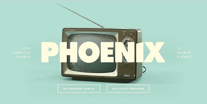
Phoenix Media
This is one of my favorite simplistic sites. The imagery is so jarring it makes you want to investigate more about what this company does. One of my favorite aspects is the parallax effect on the T.V. – as the cursor moves across the screen, the TV spins. This gives immense dimension for that Sans-serif font to sit on top of. The primary image changes if you click on ‘the creative studio’ link on the left, but the picture always moves and interacts with your cursor in some way.
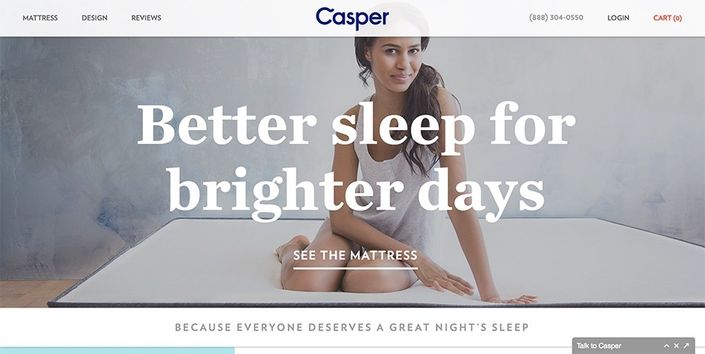
Casper
The pairing of the serif typeface here with the large image of a woman on a mattress brings this brand to life. Having a site like this in that kind of industry sets this company apart, and it makes you feel like you can really trust their product.
Hemingway Ltd.
This site has a great classic feel. You can see that the vintage-looking typeface matches the texture of the old photography in the background. The pairing of the textured look with the modern typefaces brings a professional yet aged look to the site.
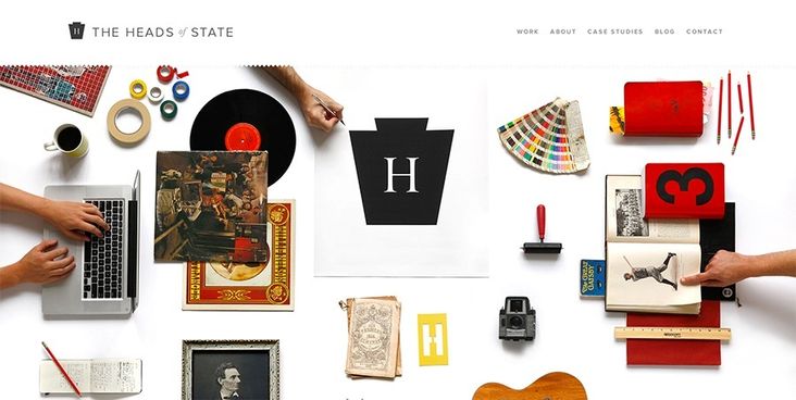
The Heads of State
This is the most expressive example of how to integrate elements of the company’s personality into a landing page. The wide variety of items on the page allows the company to express their eclectic taste, and the physical typography within the photograph allows for a more personal feel for the viewer – some of the letters look handmade, and the items themselves appear as if they could have been taken right from someone’s home.
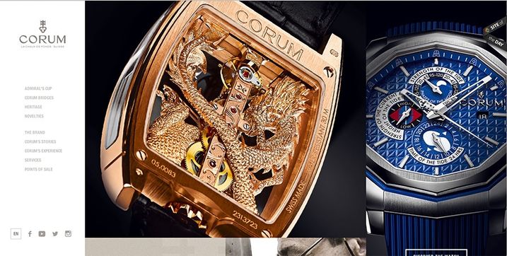
Corum
This website features products in an incredibly elegant fashion. The way the photos are laid out on the page makes their product photos into more of an art gallery than an e-commerce site. The hover effects with the typography surfacing truly add a touch of elegance as well.
Do you have some favorite sites that successfully incorporate photography and typography? Let us know in the comments below, email us at info@perfectsearchmedia.com, or tweet us @Perfect_Search!
Leah Cranston is a Troy, Michigan native who would become a shoemaker to survive a technological apocalypse. Leah firmly believes that broccoli is the weirdest thing she’s ever eaten, and says that singing on stage with The Dead Weather is at the top of her bucket list.

