Uncovering UX (Part 2): Optimizing User Experience for Travel Sites

Surprisingly enough, going on vacation can actually be one of the most stressful times of the year. Finding tickets, hotel reservations, creating day-to-day plans to make sure not a moment is wasted…it can certainly make you feel like you need a vacation, and that’s not even mentioning watching the bill slowly inch northward with every decision.
For travel providers, it’s important to establish a user-friendly website that takes some of the stress off of your audience. And with the many options available to soon-to-be-vacationers, anything to set yourself above the competition is worth a look.
That’s where Google’s leaked UX Playbook for Travel comes in, breaking down how to make your site as pleasant as possible for visitors.
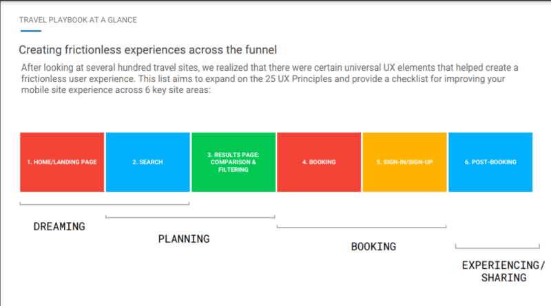
We’ve taken a deeper look at each of their sections and compiled 6 key takeaways:
1. Home/Landing Page
Of the site pages, there are none more valuable than the home page. But content-wise, the calls-to-action, or CTAs, are the MVPs.
Much like in real estate and vacations, locations are key for SEO. Placing a strong CTA, such as ‘Search our Listings’ or ‘Find your Hotel room’, above the fold on a mobile page can inspire guests to jump in and start exploring your site as soon as they’ve landed.
2. Search
When users are searching on a site, they’re really looking for the answer to appear right before them. On mobile sites, we have a great opportunity to make the menu page readily available, establishing it as a valuable resource for users.
For example, including an easy sign-in link to the site increases the likelihood that users will do so, helping you make their lives easier. Elsewhere on the menu card, try including a tab for Deals and/or Offers. This really hits a sweet spot for most travelers, many of whom are looking to avoid breaking the bank whenever possible.
3. Results Page: Comparison & Filtering
Once your audience begins to search, they’ve begun to travel down the filter but are still on their way down to a conversion (or purchase of a trip). Let’s get into the nitty-gritty of the results page to ensure the most positive user experience and highest conversion rates possible.
Allowing users flexibility in their search results can go a long way in making their lives easier. This could look like allowing sortable results (cheapest to priciest, fastest to slowest) or filtered results (with/without layovers, complimentary breakfasts).
4. Booking
Huzzah! We’re standing on the doorsteps of conversion, and opportunity’s a-knocking! Best not lose them now. A few easily-implemented, highly effective methods of punching down that door lie once again in the CTAs.
With sensitive information such as addresses or credit card information being entered into travel sites, the check-out button is a great place to remind visitors that your site is secure and can be trusted.
Extra points if that CTA can also include the exact price, including any fees, to help avoid confusion on what visitors will be expected to pay.
5. Sign-in/sign-up
Before we reach the end of the funnel, let’s dive into further detail on something that we brought up earlier: the sign-in page. After including it in the menu tab, there are a few more high-impact steps to be had.
Going through the hassle of creating a unique account profile for websites can be a cumbersome process. Allow your sign-in process to connect to outside accounts––Google reports that signing in with Facebook, Google, or other social profiles can increase conversions up to 53%.
Other moves to boost sign-ins on your site include providing clear benefits that come with creating a profile to help incentivize users.
6. Post-Booking
As users bask in the glory of scheduling their new vacation and start to dream of mountain hikes or sandy beaches, it’s important to expect the unexpected. Disruptions could always occur, from weather delays to global pandemics, and communicating that information clearly and promptly to visitors on the homepage helps lead to future conversions through high-quality customer service and trust.
All travel sites can benefit from implementing these tips across the 6 key areas of your website. By first ensuring that user experience is optimized, you’re creating long term benefits for your site in SEO and conversions.
This is part 2 in our “Uncovering UX” series, which breaks down a leaked set of UX guides from Google. These guides offer best practices for optimizing user experience in industries like finance, retail, news, and more. Check out part 1 of our series, “Elements of User Experience in News & Content Sites” here.
If you want to improve your site’s ranking and usability but aren’t sure where to start, it may be time to contact the experts. Request an audit from the Perfect Search Team today!
Hooked on UX? Download our free resource on the 3 Ways to Boost Your Website’s UX!

Erik Helm is an Ohio native who once spent nine hours at the Louvre in Paris. His favorite drink is a Bourbon Old Fashion Sour and he’d love to geek out with you about all things concerning baseball statistics.

