Uncovering UX (Part 3): Best Practices for Lead Generation
Optimizing your website for lead generation can seem like a daunting task. It can feel a lot more difficult to get a user to request more information or contact a representative (which entails giving up their personal information), than it is for an e-commerce website to make a sale.
With all that said, you are not alone in your lead generation journey. There are plenty of helpful resources to step you in the right direction, including Google themselves.
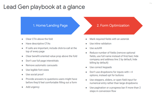
Leaked guidebooks from Google reveal their best practice recommendations and examples to ensure your website’s user experience, or UX, is in the best position possible to increase the number of leads your business receives.
Even better? Perfect Search is here to summarize and highlight the key takeaways from this deck. Keep reading to find out what they are!
Homepage & Landing Page Best Practices for Lead Generation
1. Write strong calls-to-action (CTAs)
CTAs, or calls-to-action, are a key aspect in how any website performs, not only lead gen sites. You want your CTAs to be engaging, on-brand, and to the point. With that said, Google has specific recommendations on how to put your best CTA foot forward for your lead generation site.
First and foremost, CTAs should be clear and pronounced. The moment a user lands on your website, a valuable CTA (whether it be ‘Request More Information’ or ‘Contact Us’ should always be easily accessible. The language should be straight-forward and enticing.
For CTAs at the end of a form, it should also showcase one of your company’s unique value props to further convince users. Even better, on mobile, having a CTA follow a user as they scroll has been proven to increase leads and form fill outs.
2. Tap into social proof
Utilizing social proof to gain user trust is a sure-fire way to sell your services. Social proof shows potential leads how many other users took that first step to fill out the form as well.
You could highlight the number of current customers, how many people have signed up in the last day, week, month, etc. or include customer testimonial quotes throughout the page. This strategy works (and works on me, too!) because, according to Google, “a psychological phenomenon where people reference the behavior of others to guide their own behavior.”
3. Provide value upfront
It’s important to provide value and answers to any potential questions prior to your customers filling out the form. You want to make them as comfortable and confident as possible, making it easy for them to trust and move forward with your company.
This can be accomplished by having FAQs easily accessible on your website and including useful, concrete information on every page to ease user’s potential doubts.
Website Form Best Practices for Lead Generation
Now that your homepage and landings pages are optimized for lead gen, it’s time to ensure your forms are following Google’s best practices as well.
1. Use autofill
Using autofill as frequently as possible in your forms drastically reduces the work needed from the user, increasing the probability that they will complete it. Add autofill functionality for first and last names, emails, addresses, phone numbers, and anywhere else you see fit.
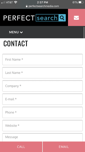
2. Minimize the number of fields required
People are lazy and want everything they do online (from buying shoes to signing up for a virtual cooking class) to be as easy as possible. This idea extends to lead generation websites.
We understand you want to receive as much information from the user as possible when they fill out the form, but this can do more harm than good. Users may see the number of fields they need to fill out and decide they’d rather not deal with it. Minimize your required number of fields as much as possible to increase user experience and conversions.
Additionally, you can also include a progress bar or navigation to make the form feel shorter.
3. Improve functionality
For the best user experience, use in-line validation to immediately alert users if information they entered (like an email or address) is incorrect. Secondly, have your form’s keypad dynamically change depending on the field.
For example, if you are asking for a phone number, utilize a dial pad to make it faster. Lastly, Google recommends having a single-column layout because multiple columns ‘interrupt the vertical momentum of moving down the form.’
Be sure to check out parts 1 and 2 of Uncovering UX, where we go over best practices for News, Content, and Travel sites.
Perfect Search is your partner in all things SEO–including user experience. Contact us for a comprehensive site audit today!

Courtney Culligan is a DePaul University graduate, but she still loves cheering on her home state’s baseball team. (The Minnesota twins, obviously.) Her dream birthday present might include a German Shepard and a trip to Japan.


