How Psychology Research Can Help You Create Beautiful Ad Design
Have you ever wondered what makes something beautiful? Zeroing in on this phenomenon is not only fascinating but useful for your ad design, too.
A beautifully designed ad can catch eyeballs in a Facebook feed already saturated with distractions. It can also increase users’ fondness of your brand, its products, and services. With this in mind, it’s in your best interest to put your best foot forward with every dollar you spend getting your brand in front of users.
Though beauty is a complex perceptual experience with much still to be discovered on how it works, the processing fluency theory of aesthetic pleasure sheds some light on this mystery. The main takeaway from this complex theory is that generally, the easier a visual stimulus is to process, the more viewers perceive it as beautiful.
Processing fluency is essentially the ease with which information is processed in the human mind. And high processing fluency is often experienced as subjectively positive and taken as information on whether a user likes a visual image or not.
Fortunately, there are many ways to make an image easier to process and thus make your design more beautiful.
Here are a few takeaways to keep in mind next time you work on fusing beauty into your ads:
-
Figure-ground contrast
-
Repeated Exposure & Prototypicality
-
Symmetry
Figure-ground contrast
Visual stimuli are easier to process when the stimulus you’re looking at is easily distinguishable from the background, and the background holds little to no interest to the viewer.
Think portrait mode on the latest new iPhones. While this mode of photography has become popular recently, photographers have actually been using it for a long time to incite social change. Photographer Lewis Hine used this strategy in his photography in the early 1900s as a tool for social reform.
His photos were influential in pushing reform for child labor laws in the United States. These photos were used by the National Child Labor Committee’s successful lobbying in 1912 for the creation of the Children’s Bureau, and later the termination of child labor in the US in 1938 by the Fair Labor Standards Act.
Many of his photos were shot with a narrow depth of field so that a narrow part of the photo is in focus and the rest is blurred out – obscuring the background and bringing attention to the worker.
Repeated exposure & prototypicality
The more you’ve seen a visual stimulus, the more familiar it becomes and the easier it is to process each additional time. Similarly, the more prototypical or reminiscent your visual stimulus is of the items you’ve seen before, the easier it is to process.
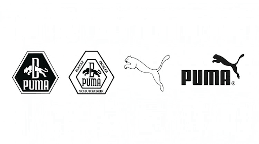
Take the evolution of the Puma logo for example:
It took a few changes between 1957 to get to the Puma logo we know today. The newer puma animal shape is much easier to look at because it looks much more exemplar of the puma animal shape we know and think of (on the right), and that makes the last versions prettier and easier to process. The first version is less similar to what your mind thinks of when you call to mind a puma. And so they are less “prototypical.”
Embracing prototypicality essentially takes advantage of the existing experiences we’ve already had. If people have an existing framework that already includes part of your brand or logo, then it is much easier to add just one more part to that existing person’s framework rather than build a totally new visual preference from scratch.
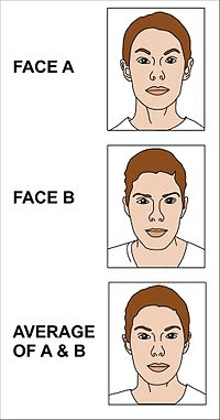
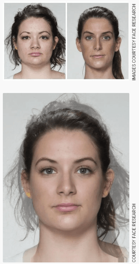
Don’t believe me yet on the concept of prototypicality? There’s a good amount of research on faces that demonstrates our human preference for “averageness.” Face research shows that the composite averaging the features of individual faces is generally seen as more attractive than any individual face. Further, the more you add, the more attractive the composite face will be generally.
Symmetry
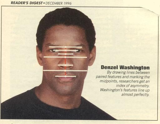
There’s a reason people bring up symmetry so much when they speak about a beautiful celebrity’s face. And there’s a reason so many brand logos utilize symmetry. Symmetrical stimuli are easier to process!
Now that you know these tips, you’re half of the way to creating a beautiful design that can grab attention and a positive association between your brand and the public. Follow these tips and you are sure to up your ad design game and make the most of your ad dollars.
—
Looking for ways to elevate your ad copy? Check out our blog post 5 Ways To Spice Up Your Business’ Facebook Ad Copy.

Drew Gorenz is a Northwestern University graduate who loves any Northwestern-related sport. He wishes he could do a spontaneous spit take. Drew’s favorite drinks are absinthe or water. One day he might be able to do a spit take with absinthe.

