Uncovering UX (Part 4): Best Practices for E-commerce and Retail
UX is extremely important for e-commerce sites–and is shown to have a direct impact on revenue and sales. If a customer finds the checkout experience confusing or frustrating, they could abandon their carts, causing you to miss out on a purchase.
Even a small web design issue can reduce your revenue stream significantly, costing you a percentage of total sales compounded over a long period of time.
So the question becomes: how do you avoid this?
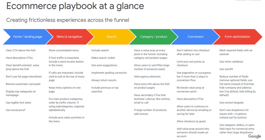
A leaked e-commerce and retail playbook from Google reveals several UX elements important to creating a frictionless on-page experience for visitors.
6 UX Best Practices for E-commerce and Retail Sites
We’ve compiled the key takeaways and best practices for e-commerce and retail marketers to apply to their own sites. Let’s get started!
1. Home/Landing Page
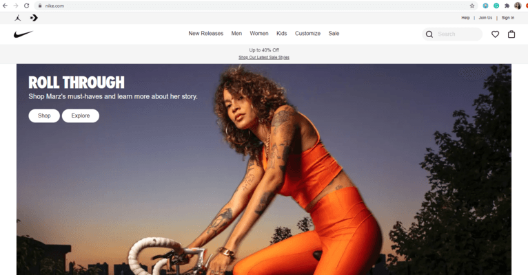
Homepages and landing pages are important as they are often the first pages users will visit on your e-commerce site. Thus, they have a strong impact on your users’ overall experience. You want to give the user the ability to navigate the page themselves, so avoid full-page interstitials and automatic carousels.
To provide as much clarity as possible without making users scroll, include a direct, descriptive CTA above the fold.
If you are having a sale and want to tell users “Shop Now for up to 20% Off”, doing so above the fold will make it visible to everyone who lands on the page instead of those who scroll down below the fold. You also want to display the top categories on the pages for easy navigation.
2. Menu & Navigation
The menu and navigation of a site is where many e-commerce businesses go wrong. This can lead to abandoned shopping carts and missed purchases. Having a clear, consolidated menu that doesn’t take up more than one page will help you lead your customers to where they need to go.
Start by thinking about the best ways your customers can find you, purchase your product, or get in touch with you. Then, provide that crucial information in the top nav.
Do you have brick-and-mortar locations that bring in a lot of revenue? Include a store locator option in your top nav. Do you deal with lots of calls with customers? Include your phone number with a click-to-call functioned pinned at the top of each page.
It’s not surprising when you think about it – giving your users the tools they need to reach the point of sale will result in more sales.
3. Search
Having search functionality is crucial to any e-commerce site.
Make sure to include a search bar in the top nav of your site, and ensure that it is visible. Implement tools like spelling correction so that if someone looking for shirts types “shrits”, they are still able to find what they need.
Some other best practices are to include auto-suggestions or include top searches.
4. Categories/Products
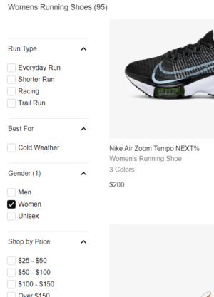
This part of the funnel is crucial in allowing users to sort and filter the products or items that they want.
If you have a wide range of products available on your site, make sure to utilize filter options specific enough that users can narrow down the list into what they want. It’s also important to include the pricing info readily available and above the fold on product pages themselves.
Adding reviews provides users with more information about how others are enjoying a product and can help provide clarity to the online shopping experience. If you are a clothing retailer, having reviewers include their height, weight, or sizing information allows shoppers to see how a clothing item fits someone similar to their size.
5. Conversion
Ironing out any problems in the checkout process specifically will lead to fewer abandoned carts.
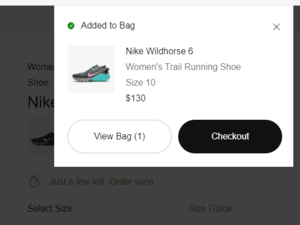
When a user adds something to their cart, don’t automatically redirect them to the checkout page. This will cut off the opportunity for them to add other items to their cart, and can discourage purchases.
Instead, try including an animation to the shopping cart icon or other on-page action to show that something has been added to the cart–without the disruptive experience of a page redirect.
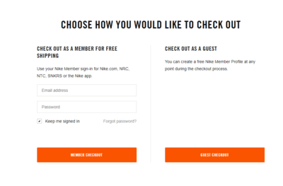
Even though you probably want more users to create accounts for your site, always keep the option open to “check out as guest.” If you have account creation as a necessary step in between adding to cart and checking out, you are going to lose out on potential sales.
Instead, create a value proposition around why they should create an account to encourage account creation while allowing the user to check out as they please.
If there are multiple steps for the checkout process (i.e. shipping information, credit card info, etc.), show a progress bar and list the steps in advance. It’s best to keep the higher commitment actions towards the end. If a user wants to try a coupon code for their cart but the steps require them to input their credit card information first, they may bounce before they test out the code.
6. Forms
The final part of the e-commerce funnel lies in the art of online forms.
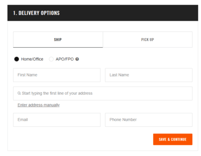
Every field (from inputting shipping information to a credit card number) is a step between the user and the point of sale. Reducing the number of fields decreases the number of steps between a customer and their purchase.
Try cutting down form sections with methods like:
-
Using 1 full name sections instead of 2 first/last
-
Hiding company, address line 2, and billing by default
-
Include autofill to populate information automatically
Plus, if a user is on mobile, make sure you have the correct keypad appear when they are filling out specific forms (i.e. the number pad for credit cards and the keyboard for shipping info).
Creating a frictionless on-page experience is crucial from the top to the bottom of the e-commerce sales funnel. Frustrated users will leave before reaching the end of the funnel. Keep users on your site by ensuring smooth UX with these tips!
Be sure to check out parts 1, 2, and 3 of Uncovering UX, where we go over best practices for News, Content, Travel sites, and Lead Generation.
Our free e-commerce resource covers the basics of creating a social ad campaign. Download it here!
Perfect Search is here for all of your e-commerce needs. We specialize in paid search, Social Media Advertising, SEO, Remarketing, Display, UX, Design, and Content. (And we like to think we’re pretty cool, too). Contact us today!

Ella Henning is a Loyola University of Chicago graduate who grew up in Cincinnati, Ohio. Before joining the Perfect Search team, she taught English (and gym!) in Spain. Her dream meal would include lobster rolls, Caprese salad, and Trader Joe’s dark chocolate peanut butter cups.

